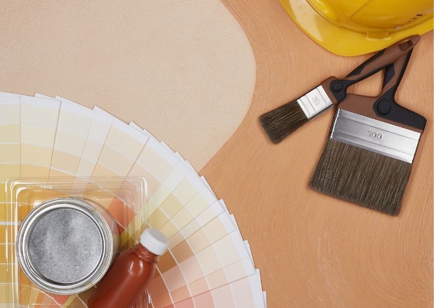
Many interior designers work with the 60-30-10 rule when it comes to implementing colour schemes in interior design projects. So let’s look at this in a little more detail and see how you can use this pro trick in your own home to achieve that finished designer look.
How to use the 60-30-10 colour rule
The rule applies to how much you should use of each colour in your room. Let’s break this down. There should be 60% of the main colour you have chosen, 30% of the secondary colour and 10% of an accent colour. The theory is that this will give you an aesthetically pleasing and balanced allocation of the colours you have chosen. So in a kitchen for example the 60% can be natural wood – kitchen units, a reclaimed wood dining table and a wooden sideboard or kitchen dresser – you can bring in 30% by painting an accent wall or pairing coloured upholstered dining chairs with a rustic dining table and for the 10% you can use table linen, a coloured toaster and kettle and wall art in your chosen colour.
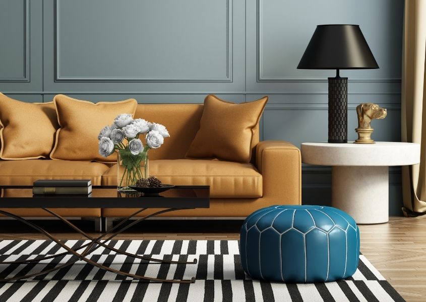
For a living room theme, why not choose a pale grey for the 60%? You can paint walls in this colour with a grey sofa and a floor rug and add a 30% blue hue via curtains, scatter cushions and throws on your sofa. For the final 10%, choose a dramatic black and add accent pieces to your room – a velvet armchair, wall art, plant pots, a table lamp etc. or you may prefer something more vibrant such as red, yellow or a rich teal.
Of course, it is your space and you don’t have to stick to the rules! We all know the best rules are there to be broken…! In the living room scenario, there is no reason why you can’t add two lots of 10% (we know, it doesn’t add up, but we’re breaking the rules!) and go for a vibrant colour as well as black. The numbers are just to help get the proportions right, the important thing is to choose three or four colours that go together well.
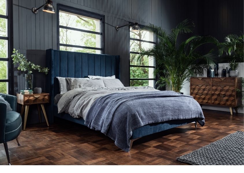 Colour in the master bedroom
Another room you can apply this to is the master bedroom. Let’s make our first 60% a soothing ‘perfect for the bedroom blue‘ – then we can add 30% in a dark navy – this can be curtains, a floor rug or an accent wall. If you were to add some printed scatter cushions as part of your bedding, to tie it all together and bring in your 10% colour, take a colour from the print on the cushions and add a small velvet armchair or bedside lamps on your bedroom side tables.
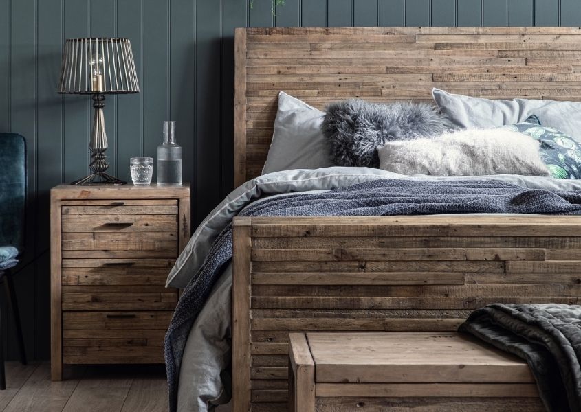
When purchasing new bedroom furniture you can easily change and adapt your colour scheme if you opt for solid wood rustic bedroom furniture. Good quality neutral bedroom furniture will last you for years and due to the classic styles will never go out of fashion. You can then simply update parts of your bedroom accessories when you fancy a fresh new look.